In late 2015 the team embarked on a total redesign of the website. The main goal was to maximize leads for the sales department. To start, we created user personas to determine how people from different industries might use our site. With these personas, we could experiment and create new ways to gather user information. Using Google Analytics to track and dissect website traffic, we arrived at a total of four user personas with two secondary personas.
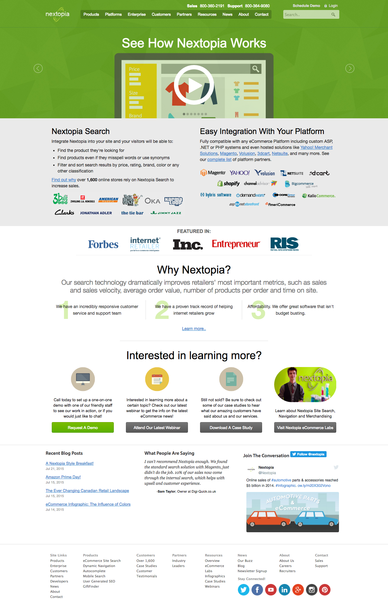
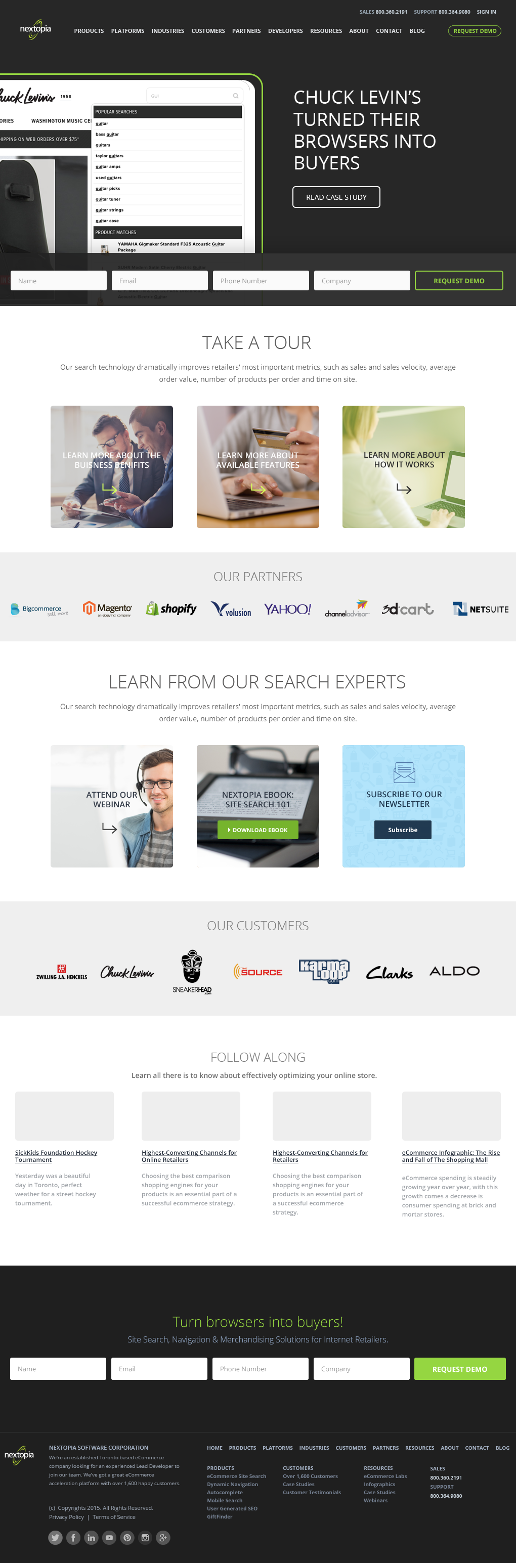
(Below is a screenshot of original website -- click to view full image)
The main design phase was our next step. We used the information we had gathered to cater our services to particular industries that use the website.
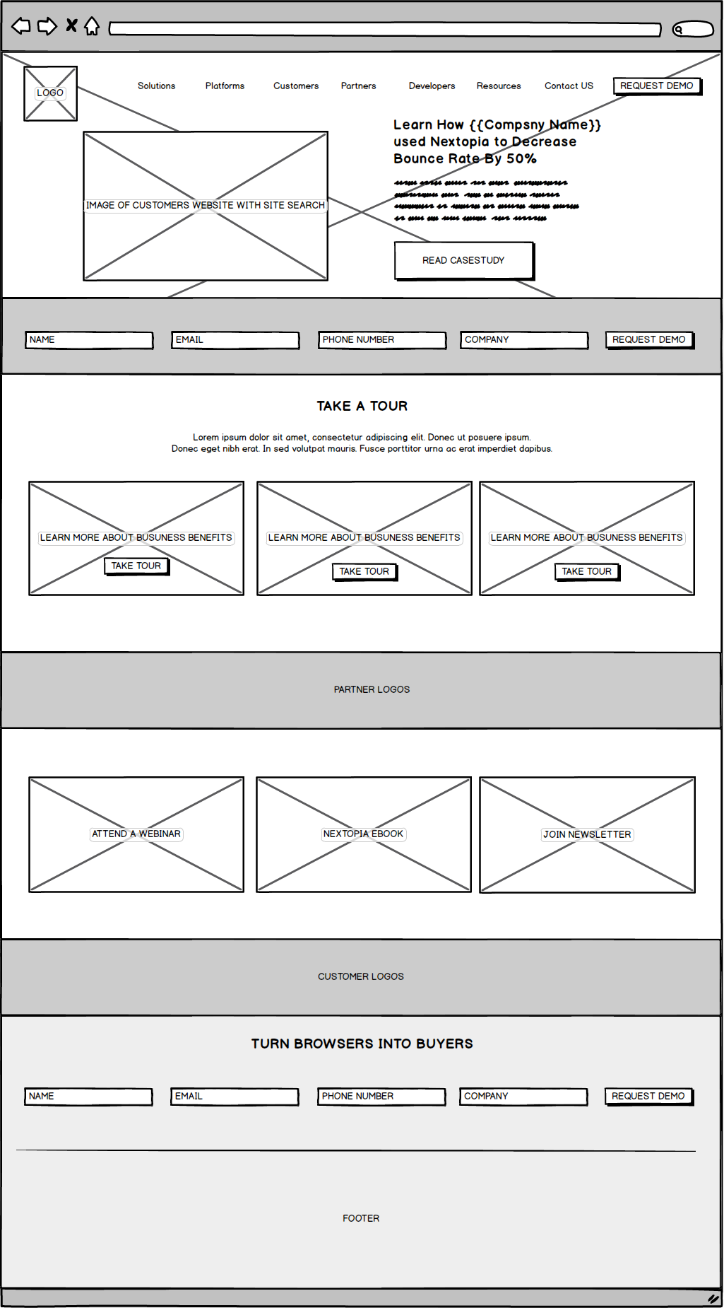
I have included the first rough wire-frame below. This had been completed before we began mapping out the UI for the website. Since our goal was to generate more leads from the home page we found it useful to include a form above the fold by reducing the steps for any user. Instead of a clicking a “Request a Demo” button, users could input their information into a simple and convenient form.
Based on the industry our user belonged to, we created different tours of our product. We did this by focusing our attention on the type of information they would be looking for.
Wire-frame of home page
First UI Design Mockup
After creating the first Homepage mock-up, we began testing our website with real users by printing off pages straight from our site and asking people questions such as,
“If you're looking to get more information about Navigation where would you go?"
During this test phase, the team quickly came to the realization that people were clicking on the main navigation as opposed to our newly created tour pages. This led us to revisit the product pages as our main focus. We also realized that because people wanted to know more about the product, they weren’t filling out the new form we created on the Home Page.
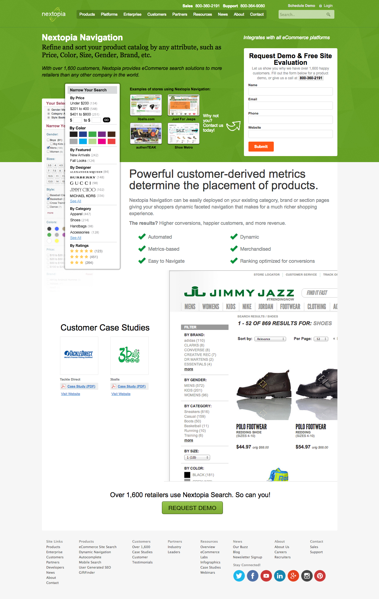
Below is a comparison of the old and new product pages.
Old Product Page
New Product Page
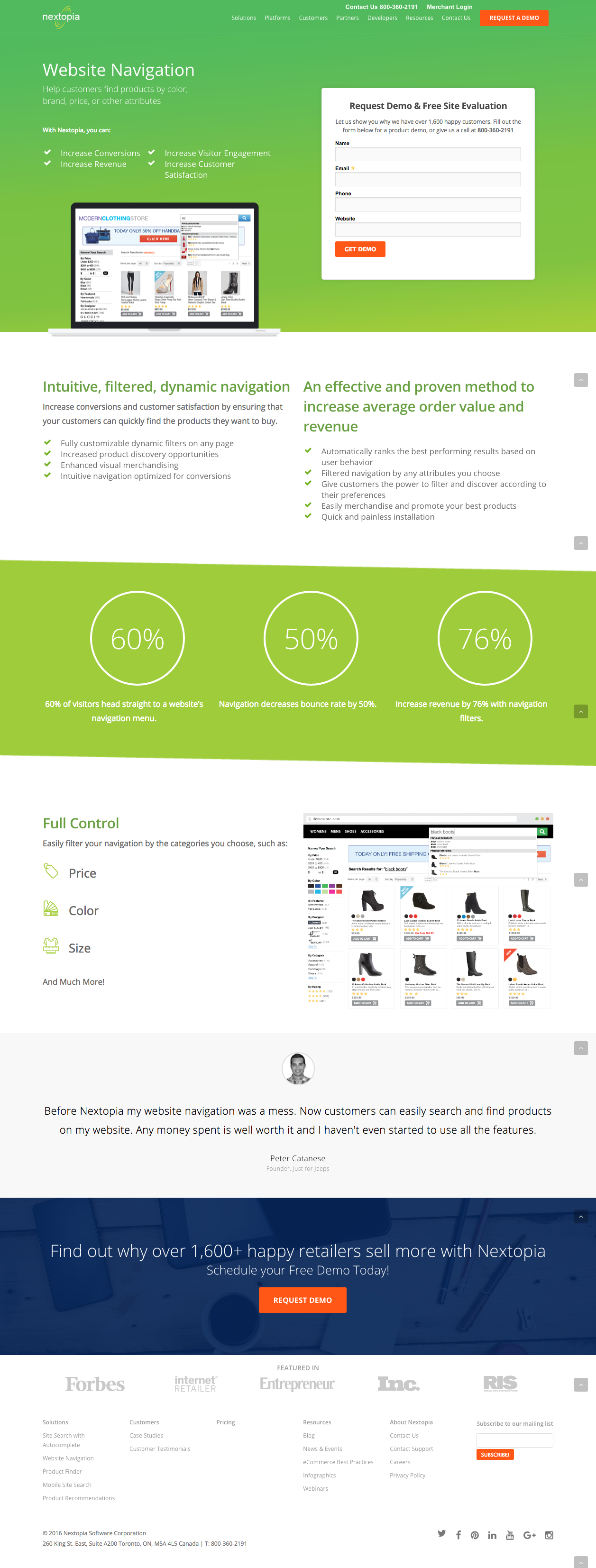
After the redesigned Nextopia website launched, bounce rates on the product pages decreased and we saw an increase in number of leads from the Product pages.
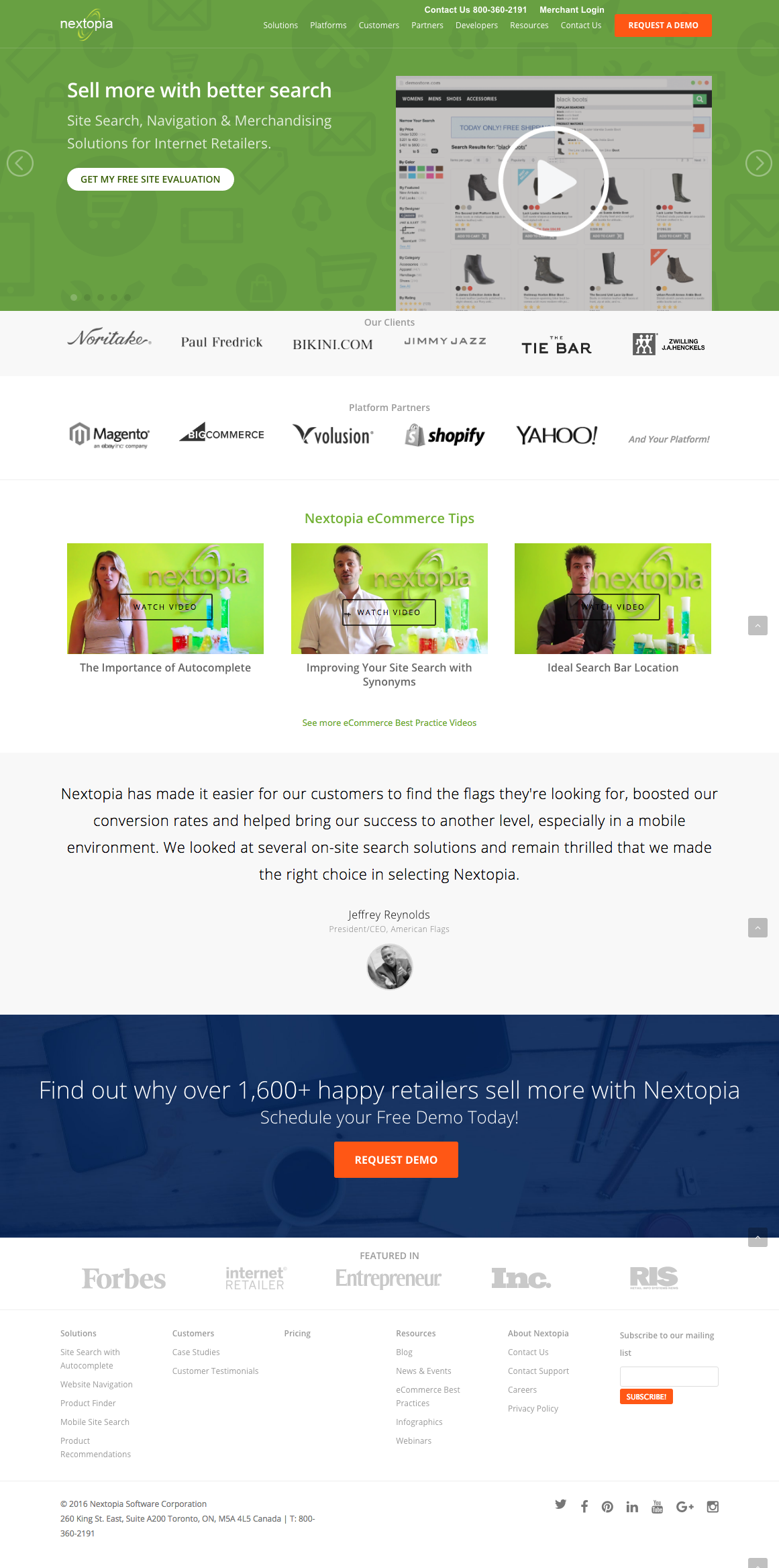
Below is a screenshot of Nextopia's current website